The Influence of Color and Style on Uniform Branding
Uniforms are a central aspect of a company’s brand, and the color and style of the uniforms directly influence perceptions individuals may have. Furthermore, first impressions have an incredible impact on both employees and potential customers, and you can be sure that uniforms play a critical role. If you are new to uniform design or are seeking to improve existing uniforms, here is a breakdown of the influence of color and style in uniform branding.
The Importance of Color and Style
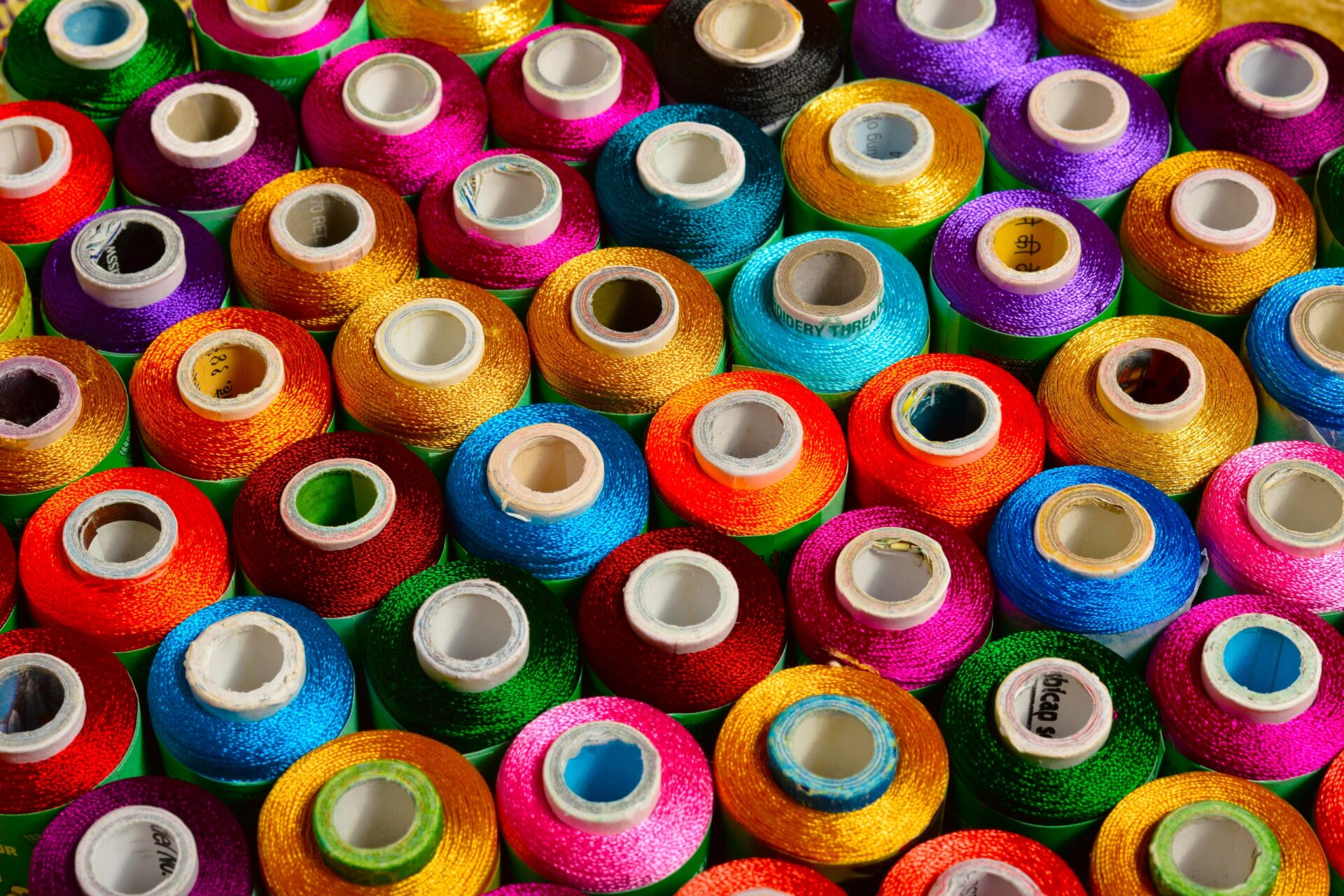
A uniform is a direct representation of a company’s brand. The color palette and style send a message without customers even needing to read a single word. When you think about iPhone, you think of white; when you think of McDonald’s, you think of red and golden arches; and when you think about Starbucks, you think of green. Starbucks has green on their employees’ uniforms, on their cups, and in their stores. The color green is central to their identity.
Whether you realize it or not, you associate a brand with certain colors; and when you combine this with the fact that colors evoke different emotions, it’s clear that color choice in uniforms bears a psychological impact.
This is also true with a uniform style. Again, without a single word, uniform styles can communicate a message and theme to customers. Casual styles invoke a relaxed, friendly atmosphere, while a more formal style speaks to sophistication and quality.
Sending a Message
Before starting to design a uniform, it is key to know the message you would like to send. This message will drive a lot of the color and style choices you’ll need to make.
Is your restaurant fun and family-friendly? Casual uniforms with bright, bold colors are perfect to relate to a fast-paced buzz.
Is your solar company the most experienced in the region? Be sure to have uniforms that are functional and relate professionalism through classic styles, such as a collared shirt and traditional colors.
Color Research and Associations
A lot of research has gone into color schemes over the years. Starting in 1666 with Sir Isaac Newton and the development of the color wheel, color harmonies through hues, tints, and shades have created a scientific analysis of how colors can work together.
Color harmonies can have an immensely positive impact on uniform branding by delivering a feeling of synergy.
Complimentary Color Scheme
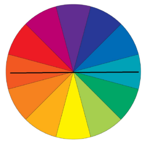
Complimentary color schemes are created by choosing colors on opposite sides of the wheel. For example, yellow and purple, orange and blue, and red and green are all complimentary choices. This style can be bright and loud, so be careful when using these colors at their full saturation.
Analogous Color Scheme
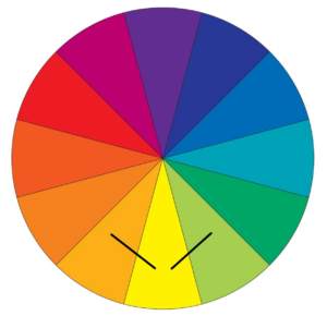
An analogous color scheme is where adjacent colors on the wheel are selected. This is a color scheme that is often found in nature, so it will feel much calmer, especially when shades are softer and not as bright. Consider choosing two of the three colors (one of them being a dominant color) and adding white or black as an accent third color.
Many more color schemes exist, including tricolor, split complementary, rectangular tetrad, and several others. It’s fun to play around with these different schemes with your company’s brand in mind, shifting shades and hues to get the perfect feel.
If you have the liberty to choose specific colors, it is critical to consider the phycology around colors. Each color can evoke different emotions and perceptions, so this will help you in delivering the theme you desire. Be aware of both positive and negative connotations!
| Color | Positive Effect | Negative Effect |
| Red | Passion, excitement | Aggression |
| Orange | Playful, friendly | Frustration |
| Yellow | Youthful, energetci | Irrational |
| Blue | Security, trust, calmness | Coldness |
| Black | Powerful, sophistication | Evil |
| Green | Health, growth | Blandness |
| Purple | Security, trust, calmness | Introversion |
Style Considerations
Style and color are often intermixed. The most popular styles include classic (shirt and tie, black and white), contemporary (modern, minimalist, and tailored), and casual (relaxed, khaki/ denim).
Integral to uniform style is functionality – make sure the uniform is a good fit for the job! For example, food industry uniforms should be HACCP-compliant and workers conducting maintenance and hard physical labor should have a durable uniform that can withstand more than the usual wear and tear.
Expert Help
Color and style can have a massive impact on uniform branding; you cannot afford to overlook this marketing cornerstone that will affect perceptions and first impressions at all times of the workday. With so much to consider, it is best to engage experts in uniform design. Contact the professionals at Accent Branding Solutions today!
Back To Blog